

Teboho Letuka
As a data analyst, I often ask myself, “how can I help my clients tell a story with data to decision-makers who may not have the time or analytical skills to engage with large datasets?” There are many tools I could use, such as data viz, infographics, or even posters, however, when clients need to engage with several indicators by location, patterns or time periods, I find dashboards very helpful. Dashboards create simple overviews of M&E indicators; they make it easier for individuals to understand and interact with data.
A data dashboard visually analyses and displays key performance indicators (KPI) to monitor key activities and demonstrate progress.
Some consider dashboards an ‘epidemic’ in that they have been used more often than is needed as a go-to for tracking process and decision -making. So, before deciding on the appropriate visualisation tool, I really need to reflect on the usefulness of dashboards and their ability to integrate with various data. With the spike in the number of dashboards created I also have more dashboard options. After deciding that a dashboard would be a good solution, my next decision is on which software to use. Selecting the right tools to develop dashboards is essential as they affect how data is packaged, how it will be used and how it integrates with current systems. I therefore also need to assess the internal team’s data visualisation capabilities and needs too.
How do I decide on the best dashboard tool?
This blog is a review of three data visualisation software to help me and YOU choose between three dashboard tools: Tableau, Power BI and Google Studio. They are compared in terms of features and accessibility which will help you decide on the best software that meets your needs and capabilities.
Because dashboards are dynamic, you should take note that you must be online to develop them; so access to the internet is essential. Also, in order to choose the best software to present your data, you will have to deliberate on the chart options that each software offers and if they will allow you to tell your story. Another important factor is assessing if it will be compatible with your data set format. All these software are compatible with Excel files which most of us usually use. But what if your data is in a different format? Will it be compatible with the data set that you are using to depict your story?
The table below presents the comparison of the three software tools focusing on four major areas only: accessibility, affordability, chart options and compatibility.
Tableau | Power BI | Google Studio | |
Accessibility | Tableau is available online and desktop. It offers a 14-day free trial for new users. Dashboards can be created using Tableau online. | Free for users with a Microsoft account. Power BI is accessible on desktop, mobile, and service. | Google studio is available on any Google device. It is currently available in 37 languages and can handle 59 international currencies. |
Affordability | Tableau offers 3 options for users; for individual a charge of $70 monthly, for teams and organisations (charges ranges from $12 to $70), embedded analytics for businesses who want to deliver analytics without building them. | The free Power BI has limited features. For more developed analysis; an upgrade would be needed. Power BI offers 2 options for user; Power BI Pro (charges R151.9 monthly per user) and Power BI Premium (charges R75, 925 monthly per dedicated cloud computation and storage resource). The premium offer is suitable for big data and cloud reporting | Google Studio is free for users with a Google account. It gives access to all connectors without charging extra. |
Chart options | Tableau offers up to 21 chart options such as heat maps, geo maps, circle views, scatter plots and packed bubbles | Power BI offers 30 chart options including bar charts, line graphs, funnel, gauge tables and maps | Google Studio has 31 chart options which include tables, score cards, line graphs, bar charts, geo maps and tree maps |
Compatibility | Tableau supports Excel files or text-based data sources such as .xlsx, .csv, .tsv. It also has 17 connectors such as MySQL, One Drive, Drop box, Amazon Aurora; that allows access data from the cloud. | Power BI is compatible with Excel, SQL, Text/CVS, XML, PDF, JSON, Google Analytics and others | Google Studio is compatible with formats such as CSV, BigQuery, SQL, google analytics, google sheets and many others. It has 18 connectors built and supported by data studio and 143 connectors built and supported by its partners. |
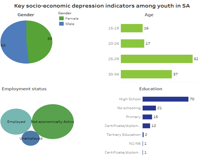
Below are dashboards developed using all three software, for comparison, the 2017 South African General Household Survey was used to generate these dashboards which present data on mental health illness among youth in South Africa. I used similar charts to visualise our data for comparability. However, because Tableau does not have a doughnut chart, it was substituted with packed bubbles. This means that if you wanted to use a doughnut chart, you won’t choose Tableau to tell your story.
Sample dashboard 1 – Google Data Studio
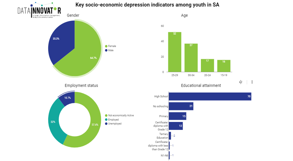
Sample dashboard 2 – Power BI

Sample dashboard 3 – Tableau
So, we’ve covered the basics on software features, and you might already have an idea of which software you want to use. Before you decide, have a look at how dashboards on all three options are. Be free to explore different choices.
