
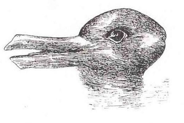
When you first look at the image below, what do you see? A duck? A rabbit maybe? Or neither?
 Source [1]
Now ask the person next to you. Was their response different?
What you see first could easily differ from what might stand out for someone else. This is because of Perceptual Organization – “it refers to the process our brains use to organize incoming information from our senses into a form that is meaningful to us” [1]
Now, have you ever been in a situation where you found yourself sitting with phenomenal evidence or conclusions, that, if you could just communicate them effectively, could inform some great ideas or decision-making? A situation where you may have tried to present your findings on some power point slides – only to be confronted by a sea of blank faces as your audience struggled to comprehend your meaning.

This may be because, while your presentation made perfect sense to you, you may have forgotten to take your audience’s interests and perceptions of the presentation into consideration when you designed it.
How people SEE your data is very important when you are communicating it. The risk of presenting data presented in a disorganized or abstract way is that the wrong meaning may be conveyed or, worse still, there may appear to be little or no meaning at all to the viewer or audience. It is therefore very important that we learn how to organize and present information or evidence in a way that allows the human brain to get it– quickly and easily.
This is why data visualization (data viz) is so powerful. It helps the brain organize data quickly, and have the meaning pop out to the reader.[2]
“Data visualization is a process that is based on qualitative or quantitative data and results in an image that is representative of the raw data, which is readable by viewers and supports exploration, examination, and communication of the data” [3]
But the data viz alone is not enough when you are trying to convey a complex or detailed message – like that 50 page quarterly report which gave you sleepless nights. Often you might need to explain loads of qualitative information, leave the reader with an emotion, and provide a clear call to action. Combining these elements of telling your data story requires the skill and the tools involved in data visualization as well as a healthy dose of critical thinking and a sprinkle of creativity.
We, at Data Innovator, call this Data Artistry.
Tell me more about Data Artistry…
Data Artistry is the exploration of ways to combine technical skills and tools with creativity and critical thinking to construct and convey compelling stories to your teams, donors, managers and other stakeholders with beautiful, well presented data. It is about learning how to draw on the perceptual and information processes within the brain and helps individuals and companies craft and communicate evidence-based findings to inform decision-making and support organizational learning.
Now you may be thinking: “But where do you learn Data Artistry?” — “I’m not creative” — “Data viz is hard”.
Our response would be: “We know a place” — “Yes you are!” — and “No, it’s not. YOU can be a data artist too.”
How and where?
At the (first ever) Data Artistry – Inner-city Learning Retreat in Maboneng Precinct, Johannesburg, the Data Innovator team will teach you the skills you need, share our toolkit, and provide you with the space and encouragement you need to unlock your creativity by putting the FUN back into the fundamentals of data visualization and reporting.
Check out the sneak peeks below, and download the Data Artistry course overview and modules and Terms & Conditions for more information. Register here >> Data Artistry Participant Registration to book a spot.
When?
Module 1: 13-15 November
Module 2: 16-17 November 2017
- Data Artistry course overview and modules
- Terms and conditions_28 Sep 2017
- Data Artistry Participant Registration
Author/s: Geeta Morar & Jerusha Govender
[1] http://www.wikipremed.com/mcat_course_psychology.php?module=2§ion=7
[2] Source: Few, S. 2nd Ed. Data Visualization for Human Perception. (in) The Encyclopedia of Human-Computer Interaction, 2nd Ed. by Mads Soegaard, Rikke Friis Dam
[3] Azzam, T., Evergreen, S., Germuth, A. A., & Kistler, S. J. (2013). Data visualization and evaluation. In T. Azzam & S. Evergreen (Eds.), Data visualization, part 1. New Directions for Evaluation, 139, 7–32