

Kanyi Saba
What is an infographic?
Infographics are a great way to present information in a creative manner and grabbing an audience’s attention. An infographic includes some assimilated data to convey a specific message and may include some data viz and graphic elements. Often, the presentation of information or data in research and evaluation is boring, long and too dense without any visual elements included. Which is why the infographic is so important.
Consider the fact that a staggering 65% of the population are visual learners[i] and we are increasingly accessing and reading content online. An infographic caters to those people better than a wordy printed document.
Infographic the word is a portmanteau of the words “information” and “graphic”, essentially it is a visual representation of information with the purpose of combining both elements to make the information represented easier to understand for the viewer.
Infographics have become popular to use for research or evaluation posters, executive summaries and incorporated into detailed reports. These can be done by graphic designers, but as a non-designer, I have worked with different software to help me incorporate design into my data reports.
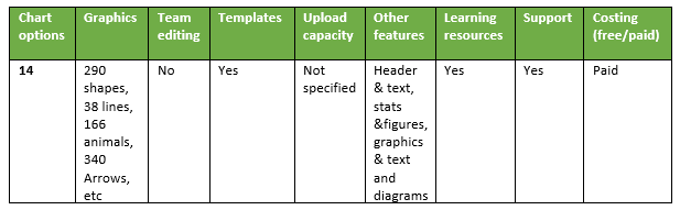
I’ve reviewed 3 great platforms for the starter infographic designer. Each has its own pros and cons. Here are the key differences to consider when choosing one of them.
Visme
Visme has numerous options for charts, icons, graphics and text, diagrams (i.e. flow charts). It shares many commonalities with the rest of the creation tools, and you can access enough features in the free option to create an infographic. Though Visme is a great tool, it does not allow for team edit to the same document. You will also have a watermark at the bottom of the infographic in the free version and may need to source additional flat icons that were not readily available in the tool.

Piktochart

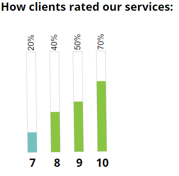
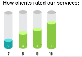
We used the unpaid limited user interface option of Piktochart to review its features. In the free option, the tool had restrictions in terms of the types of icons, charts, graphics and number of infographics. Piktochart’s interface differs from the other infographic tools in that it has more standard types/variations of charts. The images below are examples of the basic and cylinder charts you can create in Piktochart and the other in Visme. Piktochart also has limitations such as using frames rather than having a crop function, upload space and having the watermark if you have not upgraded from a free account.
Piktochart graph
Visme graph
Infogram

Just like Piktochart, we used the unpaid limited user interface option of the tool. This meant we had restrictions in the types of icons, charts, animation options, and graphics. Infogram’s interface differed from the other tools to have many functionality difficulties. These include: minimal upload space, not being able to download the infographic without upgrading the membership; the free option means the infographic is public online; not enough space to include all the information – the one-pager has less length and width space; the tool does not have an option for flipping images or shapes; colours/hex codes used in the other tools came out in slightly different shades; and an Infogram watermark on the free option.
Infogram donut chart

Visme donut chart

Each tool offers the user creative freedom and equips users with different types of functionalities to make their document what they desire to create. The tools offer the designing of different documents, i.e.; presentations; reports; printables; web graphics; social; etc. Ultimately, I prefer Visme, but other tools provide different data viz or graphic options which could be used interchangeably.
Please leave a comment below and let us know about your experiences with other infographic tools and what you think of this content. Follow us as we share more infographic tools in upcoming blogs.
[i] https://www.forbes.com/sites/tjmccue/2013/01/08/what-is-an-infographic-and-ways-to-make-it-go-viral/#79e305ea7272
